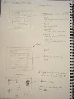
These are some of my intital Sketches for designing my website,
Design Process 1 : Design
The first image was my intital Design for the website i wanted to make it a full flash interactive website where the user would be able to scroll across the screen and interact with different objects on screen, and each would expalin more about Modern Toss etc. However this plan was to fall short because i did not forsee the lack of tutorials on this idea, moving the screen with the mouse. I played about with some ideas i'll post them aswell soon but i felt by the time it would take me to learn some of them i'd have no time to make the website, so i choose to make a standard looking website keeping within a certain style of Modern Toss.

First ideas for my website, basic layout consisting of pages ive already mentioned in the previous post. This is the best example of the Modern Toss style i wanted to include in my website with the sketchy hand drawn style. The website all keeps in line with the same layout on each page, even though its the same, continuety is best in this case. (i don't think ive seen too many websites where every page looks different - food for thought).

Next page, got tired of drawing the layout so just drew what i would be putting in the main content areas on the other pages. I could write about more but the notes explain the pictures in you click open, and this is becoming more of an evalution.

No comments:
Post a Comment