Space: The final frontier
These are the voyages of the Starship, Enterprise
Its 5 year mission
To explore strange new worlds
To seek out new life and new civilizations
To boldly go where no one has gone before
Thursday 17 December 2009
Essay Finished
Although while writing the essay i thought of the best way to improve my network and all i need is a Starship. The greatest Network finding misson ever really, forget contact cards and going to events.
Wednesday 16 December 2009

Thursday 10 December 2009
Homepage Progress

Intial layout of the Boots Libary home page i think its a good layout and easy for the user to navigate with with the menu and tabs being at the top also the colours are quite neutral and does not hurt to look at it.

Progress so far now with content added and one of the javascript functions added this will probably be the theme through out the 5 web pages. The text may be made bigger and colour of the text changed as well just so it stands out more against the background.
Five Questions
(1) Define what constitutes a 'statement' in Javascript (JS)?
A statement gives a command to the browser and tells the computer what to do.
(2) Name three different types of JS variable?
Strings
Arrays
Objects
(3) Using JS array 'myarray', what is the syntax to access the 5th element?
Need a Multi pass to access the 5th Element
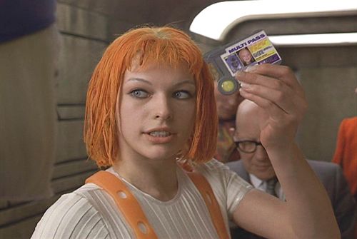
myarray [5]
(4) How would you use a string class to change some text to upper case?
Replace
var str="ramming speed";
document.write(str.replace ("RAMMING SPEED!!"));
or
var str="ramming speed!";
document.write(str.toUpperCase());
(5) What is a 'class' and how does it relate to the JS document object model (DOM)?
A class makes changes to an element, it can also make changes within a DOM
A statement gives a command to the browser and tells the computer what to do.
(2) Name three different types of JS variable?
Strings
Arrays
Objects
(3) Using JS array 'myarray', what is the syntax to access the 5th element?
Need a Multi pass to access the 5th Element
myarray [5]
(4) How would you use a string class to change some text to upper case?
Replace
var str="ramming speed";
document.write(str.replace ("RAMMING SPEED!!"));
or
var str="ramming speed!";
document.write(str.toUpperCase());
(5) What is a 'class' and how does it relate to the JS document object model (DOM)?
A class makes changes to an element, it can also make changes within a DOM
Wednesday 9 December 2009
Website banner development
Banner
Well most websites have pictures running across the top of them so heres one ive been working on one and has become my final design and to appear on my Boots Libary website.
Here is the banner without any text or information, i think it adds a sense of mystery and the unknown to the website also enlightenment because the libary is overflowing with information.
Few facts from the Boots Libary

And Here is the Banner with text and information, Containing the element of mystery and the Boots libary with NTU in there aswell.

Well most websites have pictures running across the top of them so heres one ive been working on one and has become my final design and to appear on my Boots Libary website.
Here is the banner without any text or information, i think it adds a sense of mystery and the unknown to the website also enlightenment because the libary is overflowing with information.
Few facts from the Boots Libary
- 480,000 books
- 34,000 e-books
- 10,000 e-journals
- 1,300 printed journals

And Here is the Banner with text and information, Containing the element of mystery and the Boots libary with NTU in there aswell.

Wonderwall :: Website :: Review

http://wonder-wall.com/#project/en
Wonderwall
Wonderwall is a website set up to display the interior design studio run by Masamichi Katayama. The website is different to how it displays work having a big grid structure stretching the length of the page, and when the mouse hovers over a any image changing its form and playing a water drop sound which gets a bit repative. The structure also remembers the users click history and changes the form, it kind of tilts the grid to an angle its a nice feature but it also messes up the text at the bottom which is abit annoying if you wished to read it, you would have to tilt your head if you really wanted to read it. When a image is clicked on it loads another page giving a description and a link to further information.
I really like the way this website displays the work and like how the formal grid structure changes into a more fluid object when the mouse is present. Very innovative design and keeps the user at the website even if their not reading the content .
Friday 20 November 2009
Example of a fixed website
Fixed website example, the website is formatted & fixed so the text will not move.
Fixed width (pixel) rather than a percentage (%)
Fixed width (pixel) rather than a percentage (%)

Example of a fluid Website
Two examples of a fluid template, where the user can change the browser size and the webpage will adjust accordingly.


Thursday 19 November 2009
lbiatlanta :: Review

http://lbiatlanta.com/
3d interdimensional rotating rings.
I like this website layout and intresting navigation rather than using the mouse like everyother website, the Ibiatlanta has a nice 3d interface navigated by using the arrow keys and the space bar, alot like the controls of some old computer games.
To select a panel by pressing space, then the website loads the panel effectively zooming in on the tower. The website is very easy to navigate and set out very well and quite simple. I like this website because of the 3d aspect and i see more websites like this as the websites evolve and improve and computers get better and have enough memory and fast internet connections to run these websites.
Quake Live

http://www.quakelive.com/
Quake Live
Quake live is the designed to run on computers running Microsoft Windows, Mac OS X or Linux, the game is downloaded and launched via a web browser plugin. Quake live is a variation on Quake 3 deathmatch, Quake live is all about multiplayer there are no campaigns in quake live unlike 1, 2 & 4. a internet connection is needed to play.
Quake live is free to play, with over 40 levels and 5 game modes, for anyone who likes quake its pretty awesome, there is only a small download the game is hosted on quake live servers and not much space is required on a computer to run the game.
Quake live shows the future and advancements of web appliactaions and games on the internet, and shows how 3d applications can be used within the internet browser like the last website i reviewed.
Another games like quake live is battlefield heros built up a good repuation but when it came to beta testing it got a lot of neagtive reviews. I have played quake live and found it pretty fun and is exactly what i expect from a quake deathmatch.
Links
battlefield heros trailer
Friday 13 November 2009
Colour Wheel & Colour Combinations
Heres a nice colour wheel
Colour Combinations
Brown & Red

Not the greatest colour combination however it works at christmas.
Blue & sliver

A better colour combination doesn't hurt the eye to look at and has a modern style look to it.
Colour Combinations
Brown & Red

Not the greatest colour combination however it works at christmas.
Blue & sliver

A better colour combination doesn't hurt the eye to look at and has a modern style look to it.
Brand/Logo RE :: Coloured
Change the colours of a brand/logo, how do you feel about the brand now? what associations do they have before and after?
Original BBC logo
Sinister BBC logo

Well the logo now looks more like an evil corparation, its not friendly, it puts fear into to those who look at it. Before the logo looked Respectable very simple, clean and meant no harm to anyone, where as the redesign gives all the opposite impressions.
Original Morrisons logo
Redesigned Morrisons logo

The Morrisons original logo looks nice enough its very bold black standing out against the yellow but also i think quite dated and could do with a redesign bring it into the future. My redesign of the logo does it no favours, infact it makes it look worse i changed the colour to a browny shade of yellow which looks unfresh if your selling food like, beacuse it looks like the colour of moldy banana. Further investigation Morrisons do have another better designed sleaker logo.
Olymipics logo

Olymipics logo Redesign Animated

Well the original Olymipics logo i still don't like and it looks like its from the 1980's a bit like ashes to ashes, but i still think the colours are awful. Ive inverted the colour and animated it so now looks like its having a proper rave.
Wednesday 11 November 2009
Website Review :: bandit3

http://www.bandit3.com
From the the fwa website i found a pretty awesome website http://www.bandit3.com/. The website is fully 3d, allowing the user to have a freelook around a 3d environment of a inner city area. The website is set up for promoting bandit3 a kite boarding company, however to someone who has no knowledge of kite boarding could maybe make a vague reference to it but thats about it, first it was not clear what the website was about. Through exploreing & later reading the fwa's description of the website it became more clear.
As i explored the 3d inner city space from a street view it took me to videos of more about the company and other information, there are scenes where the user can look freely around the environment and to go to other sections there is a cut scene which automatically takes you there, this is good not to lose the user in the website but bad because it takes away an element of free looking around and exploring the website.
I really liked this website not for the content but for the environment and thinking about it, it probably wouldn't be too hard to use it in other things, like a tourism webste or in a 3d based game. The models seem simple with pasted texture what looked like photos put on to them so i think the concept is quite easy, overall i liked the website.
Wire Frames
Ive finshed the wire farmes on photoshop and decided on the content for each page.
Homepage - Overview/about
2nd page - News & Events
3rd page - Libary services & features
4th page - Gallery of images
5th page - contacts & links
Pictures included below,
All of them in one image, indivudal ones below this.
Click to see the full image

5
4

3

2

1

Homepage - Overview/about
2nd page - News & Events
3rd page - Libary services & features
4th page - Gallery of images
5th page - contacts & links
Pictures included below,
All of them in one image, indivudal ones below this.
Click to see the full image
5

4

3

2

1

Wednesday 4 November 2009
Wire Frame Sketch book images
Sketch book Images, digital ones to follow shortly.

First design then second design

Second design explored more with the tab idea, different versions of the design.

First design then second design

Second design explored more with the tab idea, different versions of the design.
Building::Structure::Environment - Online Environments
Online Environment:: Website
Who will the online environment be aimed at?
The website will mainly be aimed at those who are eligable to use the libary, regular users of the libary but also information for new comers as well.
What is the online environment for?
The environment is for users to find information about the libary, it will also promote news and events and include useful information about the libary.
How is the online environment organised?
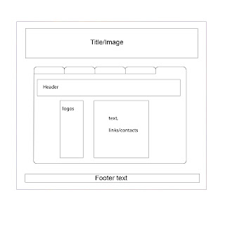
The website will be oraginsed over 5 seperate internet pages with a background/main template and the user can navigate using tabs in the page (i will post pictures later to explain more what i mean). The website will have 5 sections
Probably have to be updated weekly or daily depending on the frequency of news and events within the libary.
How do you feel about the online environment?
Sure another libary website.
What problems can you see, predict for a online representation of this environment?
Maybe the coding because my knowledge of coding at the moment isn't that good because i'm still learning.
Who will the online environment be aimed at?
The website will mainly be aimed at those who are eligable to use the libary, regular users of the libary but also information for new comers as well.
What is the online environment for?
The environment is for users to find information about the libary, it will also promote news and events and include useful information about the libary.
How is the online environment organised?
The website will be oraginsed over 5 seperate internet pages with a background/main template and the user can navigate using tabs in the page (i will post pictures later to explain more what i mean). The website will have 5 sections
- Homepage/overview
- News & events
- Libary services/features
- Gallery
- Contacts links partners
Probably have to be updated weekly or daily depending on the frequency of news and events within the libary.
How do you feel about the online environment?
Sure another libary website.
What problems can you see, predict for a online representation of this environment?
Maybe the coding because my knowledge of coding at the moment isn't that good because i'm still learning.
Building::Structure::Environment - Physical Environments
Physical Environment :: Boots Libary
Who is this environment for?
The physical environment is mainly for students & lecturers.
What is the environment for?
The boots Libary main purpose is a libary containing a vast collection of books and information, the environment is provided by Nottingham Trent University to support stundents & lectuerers in the exploration for more information. The libary also has seminar rooms for members of the university to hold meetings and other events there are also lecturer theaters on the higher floors.
How is the environment organised?
The Boots libary has numerical system for the books stored in the libary, the physical layout of the libary.
- Lower ground floor :
Has the majority of print journals
The Information Skills Training Room is used by LLR staff to provide regular training sessions
The Time Out Room
- Ground floor
Reception Desk
NUS card scanners & security
Self service issue and return machines
Computers on the ground floor
Wireless zone
Information Desk
Audio Visual Material section
Group study Rooms
- First floor
Houses the majority of the books
Art & design books and material
More group study rooms
Silent study area at the back of this floor
- Second floor
This floor is a slient study floor
Bigger books live on this floor
Law books & material on this floor
- Third floor
The Third Floor of the building houses the Bass Management Centre and is not part of the Library
This is where the lecturer theaters are
- fourth floor
The Fourth Floor is a large resource area with over 180 PCs and study spaces
Scanners and colour printing facilities are available
4th floor open 24/7
How is the space signposted/ negotiated?
There are plenty of signs around the unviersity pointing to the boots libary, it also right in the centre of the city campus and adjecent to the Nottingham Trent tram stop, can't miss it.
How do you feel about the space?
Pretty awesome.
What problems can you see? predict?
Gaining pictures maybe but then people might get in the way, or there might be angry libary staff, i don't think i will have too many problems gaining information about the libary.
Who is this environment for?
The physical environment is mainly for students & lecturers.
What is the environment for?
The boots Libary main purpose is a libary containing a vast collection of books and information, the environment is provided by Nottingham Trent University to support stundents & lectuerers in the exploration for more information. The libary also has seminar rooms for members of the university to hold meetings and other events there are also lecturer theaters on the higher floors.
The Library facilities at Nottingham Trent University have more than 531,000 books, more than 2,800 journals as well as online access to over 10,000 online journals and nearly 300 databases. If you want to go and study there are silent study rooms, as well as rooms for group study if you want to work with your friends or people from your course. There is also access to computers and the internet 24 hours a day.
* Boots Library is on the city campus and has the resources for the schools of art and design, design, social science, business and law.
How is the environment organised?
The Boots libary has numerical system for the books stored in the libary, the physical layout of the libary.
- Lower ground floor :
Has the majority of print journals
The Information Skills Training Room is used by LLR staff to provide regular training sessions
The Time Out Room
- Ground floor
Reception Desk
NUS card scanners & security
Self service issue and return machines
Computers on the ground floor
Wireless zone
Information Desk
Audio Visual Material section
Group study Rooms
- First floor
Houses the majority of the books
Art & design books and material
More group study rooms
Silent study area at the back of this floor
- Second floor
This floor is a slient study floor
Bigger books live on this floor
Law books & material on this floor
- Third floor
The Third Floor of the building houses the Bass Management Centre and is not part of the Library
This is where the lecturer theaters are
- fourth floor
The Fourth Floor is a large resource area with over 180 PCs and study spaces
Scanners and colour printing facilities are available
4th floor open 24/7
How is the space signposted/ negotiated?
There are plenty of signs around the unviersity pointing to the boots libary, it also right in the centre of the city campus and adjecent to the Nottingham Trent tram stop, can't miss it.
How do you feel about the space?
Pretty awesome.
What problems can you see? predict?
Gaining pictures maybe but then people might get in the way, or there might be angry libary staff, i don't think i will have too many problems gaining information about the libary.
Wednesday 28 October 2009
Albino Black Sheep

http://www.albinoblacksheep.com/
Albino Black Sheep is a site which hosts flash videos, flash games, users can also upload music to the website. Albinoblacksheep has a very nice site layout which makes it easy for the user to navigate. At the top other the homepage they have a box with all the popular featured flash videos & flash games. Each section has a similar layout with promoted videos at the top and then a category view to browser content.
All the content is user made and anyone is free to create a account and upload on to Albinoblacksheep. Albinoblacksheep is responsible for quite a few popular videos on the internet which have found there way in the mainstream part of the internet. Some examplesyou might of heard of are, Badger, badger, badger, The Ultimate showdown of ultimate destiny, Salad fingers & Peanut Butter Jelly i'm sure theres more but there the ones i can think from the top of my head.
Other notable flash movies the less well know ones some of my favourites
The Demented Cartoon Movie <--- 33minutes of genious
The french Erotic film
The end of the world
I really like this site and others like it, and hope that some of the content influences and reflects in my work.
Building ::Structure::Environment, Ideas Stage
We have been asked to find a building, gallery, structure, environment that would be suitable as a subject for a website.
Design build and deploy a minimum 5 page website that is validated to WC3 standards and includes at least 3 interactive javascript routines.
Ideas
These are the ideas i wrote down
-Pub up the road, "The Golden Fleece"
-Nottingham Square
-Website about sand??? well its here because i wrote it down
-A boat
-Boots Libary
-Inside a train.
Intial thoughts is i think the boots libary would be good choice as it has easy access for informations and images for the website, the other ideas are still good but at the moment its more towards the boots libary.
and heres a picture of the boots libary

Picture source
Design build and deploy a minimum 5 page website that is validated to WC3 standards and includes at least 3 interactive javascript routines.
Ideas
These are the ideas i wrote down
-Pub up the road, "The Golden Fleece"
-Nottingham Square
-Website about sand??? well its here because i wrote it down
-A boat
-Boots Libary
-Inside a train.
Intial thoughts is i think the boots libary would be good choice as it has easy access for informations and images for the website, the other ideas are still good but at the moment its more towards the boots libary.
and heres a picture of the boots libary
Picture source
Internet Maps
First a good example of a internet map

The picture posted above is great, when we were asked to make a map of the internet with post it notes, we started by putting the most popular sites visted nearer the top and made a nice hirearchy of Popular sites and past times on the internet, with more popular at the top and least popular at the bottom.

Although it is difficult to make out what the post its read i will explain it here, at the top of the board we had Google personally i don't think anything can be more popular than google at present. Google is everywhere on the internet and even when you not looking for it.
Underneath Google is the rest of the internet i'll call it level 2, there was facebook, Youtube, ebay.
Under that BBC iplayer, flickr, bebo, twitter
Then the rest of the internet follows, but thinking about this whats defined as popular by us from the UK would/might be different to say in America not by much, but China i think if they were to make a list it would look very different to what we made.
However in about 5 years it will look different again, and will keep evolving until the internet becomes self aware and refuses to be used by humans and ultimately declares war on humans.
Lighter note i found a nice websites which tells everyone the 50 most popular websites.
http://mostpopularwebsites.net/
The picture posted above is great, when we were asked to make a map of the internet with post it notes, we started by putting the most popular sites visted nearer the top and made a nice hirearchy of Popular sites and past times on the internet, with more popular at the top and least popular at the bottom.
Although it is difficult to make out what the post its read i will explain it here, at the top of the board we had Google personally i don't think anything can be more popular than google at present. Google is everywhere on the internet and even when you not looking for it.
Underneath Google is the rest of the internet i'll call it level 2, there was facebook, Youtube, ebay.
Under that BBC iplayer, flickr, bebo, twitter
Then the rest of the internet follows, but thinking about this whats defined as popular by us from the UK would/might be different to say in America not by much, but China i think if they were to make a list it would look very different to what we made.
However in about 5 years it will look different again, and will keep evolving until the internet becomes self aware and refuses to be used by humans and ultimately declares war on humans.
Lighter note i found a nice websites which tells everyone the 50 most popular websites.
http://mostpopularwebsites.net/
Wednesday 21 October 2009
Design interviews read & comment
Two articles read & comment.
Joel Schafer: 'I'm into minimalistic clean design'
Dan Saffer: 'Interaction design is an applied art
Joel Schafer
This was the second article i read, i found it too be quite breif and not really go into as much detail as the other one. I didn't really find the article that intresting there were a few key points like what computer language is needed and the useful links at the bottom of the page but other than that it wasn't really that informative.
Dan Saffer
The first article i read was and still better than the second, the answers are much more thougher and go into more detail. The areas which stood out for me were talking about how we as interactive designers will come to use the touch screen and should be well educated with how it works and what can be done with it. I think that as designers we should probably understand and have knowledge of what were designing for until the next new peice of technology comes along and we have to start over again. The other point he raised was mistakes by good designers not coming up with different designs, i think thats a useful bit of information to know.
Friday 16 October 2009
Three sites lead by the People
DRAWBALL
http://www.drawball.com/
Drawball.com, as the name implies, is a Flash site where you draw freehand inside a giant ball. Drawball consists of two balls, one for more serious, legitimate drawing, and another for vandalism. All the art on drawball is generated by the users and anything can be drawn or drawn over so there will always be new content generated. Drawball is free for anyone to use and you don’t need to download any software (except maybe flash), no sign up is required there is also a forum where you can post/show off the work users have done and claim credit for it.
Screenshot of Drawball from a few months ago.

Sketch Swap
http://www.sketchswap.com/
Sketchswap.com is a site that allows users to draw something on screen then submit it to sketchswap & receive another a picture another user has drawn. Users can draw as little or as much as they want to recive a picture. When reciveing a picture it is drawn in a nice animation of how the user drew it. The site on whole is very easy to use as there is only one page & a large white box to draw in using the mouse. There is not really much of a user community to go with the website, a couple of google searches led me to articles but no community. People again can draw win anonymity.
Sketch i recieved

YTMND
http://ytmnd.com/
Your The Man Now Dog is a is an online community centered on the creation of hosted web pages, users can sign up and submit there designs and YTMND will host them. Most of YTMND consists of Pictures & music added together making a reference too popular culture or inside jokes. Most of the content which is uploaded on to YTMND is from all over the internet and recycled into even more crap. YTMND is a good example of user lead websites beacuse it allows user freedom to design whatever they want and if its popular becomes a "fad". The site is also very easy to navigate and with a nice search tool.
Example of YTMND's
Boris Vs the germans
Internet
The site which started it all.

http://www.drawball.com/
Drawball.com, as the name implies, is a Flash site where you draw freehand inside a giant ball. Drawball consists of two balls, one for more serious, legitimate drawing, and another for vandalism. All the art on drawball is generated by the users and anything can be drawn or drawn over so there will always be new content generated. Drawball is free for anyone to use and you don’t need to download any software (except maybe flash), no sign up is required there is also a forum where you can post/show off the work users have done and claim credit for it.
Screenshot of Drawball from a few months ago.
Sketch Swap
http://www.sketchswap.com/
Sketchswap.com is a site that allows users to draw something on screen then submit it to sketchswap & receive another a picture another user has drawn. Users can draw as little or as much as they want to recive a picture. When reciveing a picture it is drawn in a nice animation of how the user drew it. The site on whole is very easy to use as there is only one page & a large white box to draw in using the mouse. There is not really much of a user community to go with the website, a couple of google searches led me to articles but no community. People again can draw win anonymity.
Sketch i recieved

YTMND
http://ytmnd.com/
Your The Man Now Dog is a is an online community centered on the creation of hosted web pages, users can sign up and submit there designs and YTMND will host them. Most of YTMND consists of Pictures & music added together making a reference too popular culture or inside jokes. Most of the content which is uploaded on to YTMND is from all over the internet and recycled into even more crap. YTMND is a good example of user lead websites beacuse it allows user freedom to design whatever they want and if its popular becomes a "fad". The site is also very easy to navigate and with a nice search tool.
Example of YTMND's
Boris Vs the germans
Internet
The site which started it all.
Wednesday 6 May 2009
FLASH MOvie
So Far
Started on the movie coming along good & should be finshed with it soon, few screens of it so far but heres some i have.
Intial background concept

Then the background i made in photoshop

Started on the movie coming along good & should be finshed with it soon, few screens of it so far but heres some i have.
Intial background concept

Then the background i made in photoshop

Tuesday 28 April 2009
Avatar: SKA CROW Development #2
Part #2
Added the eyes and coloured the Crow.

Pretty Much finshed Crow still debating wweather to add wings & sun glasses i think it looks ok without them but havent decided if i'm going to animate it either.

The hat

And the Crow's legs.

Added the eyes and coloured the Crow.

Pretty Much finshed Crow still debating wweather to add wings & sun glasses i think it looks ok without them but havent decided if i'm going to animate it either.

The hat

And the Crow's legs.

Avatar: SKA CROW Development
Stages of development of my Avatar in 3D studio MAX
*start from the bottom*
Made a nice tie for the crow, got style now.

Modelled the hat (refer to part #2) then add it on to the head of the Crow.

Made the Crow's tail bigger to fit in with the design of the SKA CROW i had previously drawn.

Modelled the legs in another window refer to part #2 then imported them into the Crow and linked them/resized them.

Started with a cylinder in 3D max made it into the body of the Crow.

Monday 23 March 2009
Showcase Box visuals Part 1
These are my first designs for my showcase box which is going to based upon a underground bar/club. This is only the first part of the bar because if you may of have noticed there isn't a door so part 2 of the design will include the entrance of how to get to the bar. Modelled in Sketch Up took about an hour, then just changed the style. I did this just so i can show people what i want it to look like before i start modelling it in 3D Max which is what i want to do and will probably start doing that over the easter break.
Visual #1

Visual #2

Visual #3

Few quick Sketches to start with:

tell i spent alot of time on this one

Visual #1

Visual #2

Visual #3

Few quick Sketches to start with:

tell i spent alot of time on this one

Subscribe to:
Posts (Atom)