Group Meeting, Ideas
Here are the notes we`ve taken on Monday with regards the ideas for the one-shot film:
1. Split-screens : 4 different stories played out on a split-screen
2. Circular story on adjacent laptops (though the stories that are played out are different, there is a continuity of action from a sequence shown on one screen to the other)
3. Adbusters (street art, advertising subversion, night scene....more details)
4. Police station interrogation (maybe try to film it from different perspectives...again, can make use of split-screens)
5. Waist-bellow shot (we have to find a narrative idea for this one)
6. Again, split-screen. Only this time, one story from different angles (not perspectives, just angles)
7. Something along the lines of the introduction to the movie Snatch
8. Big Brother rooms.
-House mates talking to the camera each house mate comes into shot then leaves and the next one follows, or just a random scene in the Big Brother house
9. First Person Movie,
- think the Nrowich advert is a good example of the idea (only ours would be without the cuts just always stay first person)
mmm biscuits, make first person film in a metting.
10. Sleep/drunk Making food
- fun idea everyone gets hungry in the night just who knows what you make when your asleep?
Wednesday, 26 November 2008
Tuesday, 25 November 2008
Glass Of MILK
Fridays editing seminar
Film "The Autopsy"
all she wanted was a quiet drink, i'm pretty pleased with it because it made me laugh so thats always good i think.
Film "The Autopsy"
all she wanted was a quiet drink, i'm pretty pleased with it because it made me laugh so thats always good i think.
Monday, 24 November 2008
Complementary Colours
Complementary colours are, two colours on opposite sides of the color wheel, which when placed next to each other make both appear brighter.
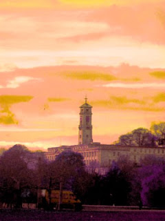
In the first 2 images i changed the colour of the sky to Red (and in some parts pink), i did this to show how the green and the red contrast each other and both make each colour stand out. The building was originally green so i didn't change the colour of that.


In the next two images i changed the blues in the picture to oranges and the green dark colours to purple to show how orange and purple contrast each other, this makes the picture look kind of surreal but i think it shows well how complemtary colours work because in the first picture you have to look harder to see the blue van, but then when i changed it to orange it clearly stands out in front of the purple tree line.


Both pictures were taken at the Colour and light exibition just outside around the grounds.
In the first 2 images i changed the colour of the sky to Red (and in some parts pink), i did this to show how the green and the red contrast each other and both make each colour stand out. The building was originally green so i didn't change the colour of that.


In the next two images i changed the blues in the picture to oranges and the green dark colours to purple to show how orange and purple contrast each other, this makes the picture look kind of surreal but i think it shows well how complemtary colours work because in the first picture you have to look harder to see the blue van, but then when i changed it to orange it clearly stands out in front of the purple tree line.


Both pictures were taken at the Colour and light exibition just outside around the grounds.
Wednesday, 19 November 2008
Colour and The Intangible Exhibition at Djanogly Art Gallery, Lakeside

So Sometime last week, Friday I think went on a cool trip to the Colour and The Intangible Exhibition at Djanogly Art Gallery, Lakeside. Got a few pictures 007 style (they didn't like people taking pictures) so I'm going to write about one picture which I could get a decent picture of, which is the one which looks like its of a old BT advert...
So what was the Artist thinking about when he/she Designed the spinning vortex of colour? Well one possibility is that they had seen a BT commercial from a while back which looks very similar to the Artists work, so that could be one of the things which influenced them. The Artist was trying to make the colours stand out from the background making it a more striking image, attracting the viewer into the picture. The artist has initially only used the 3 primary colours and as the specks of light cross then you see the other colours made by mixing of 2 primary colours. If you were to interpret the image I think a good way to describe it would be to say that if you have these these things were are fine by themselves but then bring them together and mix them up to get something new and maybe even better.
Labels:
and,
Art,
at,
Colour,
Djanogly,
Exhibition,
Gallery,
Intangible,
Lakeside,
The
Sunday, 16 November 2008
Rule of Thirds
Rule of thirds is a rule in film & photography where the picture is divided up into thirds by a grid. The object in the picture has to be where the grid interersects are and this is supposed to create more tension and energy in the picture! check the examples below to see what i mean,


Sunday, 9 November 2008
Tuesday, 4 November 2008
Why design?
Why Design?
Ok looking around my room for something to write about nearest thing too me my Nintendo DS, that's a pretty neat bit of design. Its says here “why is it we want our belongings to do more for us than function well?” Personally I'm happy with my Nintendo DS the way it works and looks, but I suppose other people will want them to look good at the same time. They can show it off to all there friends, work colleges etc.
The latest version is cool therefore I'm now cool for having it and everyone will be not as cool as me because they don't have the new version they've all got the older versions which aren't as cool any more. I believe it works something like that if you have the latest version of something you are cool until a new one comes out.
“Why are we willing as soon as we can afford it to pay extra for things with appealing forms”, easy answer because it probably looks better. It will do the same thing as the old version, just it will look better. I can use the Nintendo DS as a great example because I still have the original when it came out never really cared for the Nintendo DS lite. (soon to be replaced with the Nintendo DSI third in the Nintendo DS generation) The Nintendo DS lite looks better but I don't feel I have to buy a Nintendo DS lite just because it looks better because my Nintendo DS does all the same things as a Nintendo DS lite would do, only extra features I can think of are it has a bigger stylus, cover for the GBA slot and a adjustable brighter screen. Maybe when it breaks I'll consider getting a Nintendo DS lite, but it hasn't broken yet. Other people may want to upgrade as soon as a new one comes out and they'll probably will be cool for doing so.
Pic Related: my DS

Subscribe to:
Posts (Atom)